常见问题
组件 TypeScript 类型不兼容或错误 ?
借用Ant Design Pro官网的一句话:
TypeScript 毕竟是一个标注语言,在需要使用 any 的时候不必吝于使用 any,在遇到【动态性比较强的代码】时,不妨使用 as unknown as XXX, 可以节省很多时间。
@ts-ignore @vue-ignore
有些时候类型错误是组件的,但是看起来非常难受。会一直编译报错,这里就可以使用 @ts-ignore 来暂时忽略它,在模板中还可以使用@vue-ignore
*.vue
html
<template>
  <!-- @vue-ignore -->
  <!-- 报错的组件 -->
</template>

<script lang="ts" setup>
  // @ts-ignore
  // 报错的行
</script>表格的 columns 使用 ref 定义类型报错
ts
import type { Ref } from 'vue'
import type { PlusColumn } from 'plus-pro-components'

//  const columns = ref<PlusColumn[]>([])   类型替换为下面的写法
const columns: Ref<PlusColumn[]> = ref([])是否兼容element-plus@2.6.0 ?
按钮,placeholder,标题文本显示异常?
问题原因:未配置 plus-pro-components 的国际化。
解决方案:配置国际化
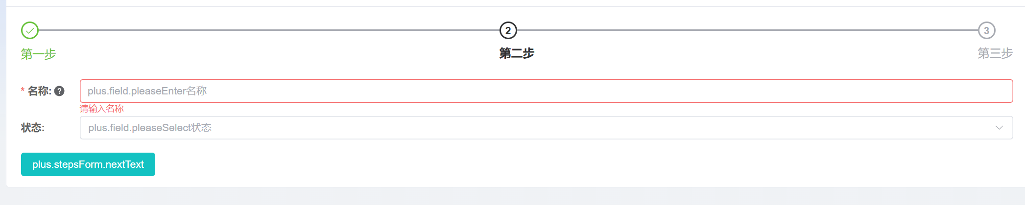
国际化配置了不起效果?
表单字段改变后怎么根据改变字段的值通过接口获取另一个字段的 options?
PlusTable 和 PlusForm 复用 PlusColumn 问题?
单个组件的事件在哪里配置?
PlusTable 表格操作栏如何居中显示?
小于v0.1.7
css
.plus-table .plus-table-action-bar .cell {
  justify-content: center;
}大于等于v0.1.7
html
<PlusTable :action-bar="{ actionBarTableColumnProps: { align: 'center' } }" />PlusTable 表格操作栏如何做权限控制?
小于v0.1.7
可使用 ActionBarButtonsRow 中的 show 字段控制。 示例
大于等于v0.1.7
可使用 ActionBarButtonsRow 中的 directives指令字段控制。示例
搜索表单如何改变重置、搜索按钮的顺序?
css
.plus-search__button__wrapper .el-button {
  order: 2;
}

.plus-search__button__wrapper .el-button--primary {
  order: 1;
  margin-left: 0;
  margin-right: 20px;
}

.plus-search__button__wrapper .el-link {
  order: 3;
}PlusForm 里面的表单元素,想单独占一行,但是宽度是{colProps: {span: 8}} 怎么配置?
ts
import type { PlusColumn } from 'plus-pro-components'

const columns: PlusColumn[] = [
  {
    label: 'test',
    prop: 'test',
    colProps: {
      span: 8, // 实际宽度是 33.3%
      // @ts-ignore
      style: { marginRight: '67%' }
    }
  }
]表单中的某项如何添加 ref 获取实例,使用实例的方法?
vue
<template>
  <el-card>
    <PlusForm v-model="state" label-width="140px" :columns="columns" />
  </el-card>
</template>

<script lang="ts" setup>
import { ref, watch } from 'vue'
import type { PlusColumn, FieldValues } from 'plus-pro-components'

const state = ref<FieldValues>({
  'tree-select': ''
})

const treeSelectInstance = ref()

watch(treeSelectInstance, val => {
  console.log(val, 'val')
})

const cascaderOptions = [
  {
    value: '0',
    label: '陕西',
    children: [
      {
        value: '0-0',
        label: '西安',
        children: [
          {
            value: '0-0-0',
            label: '新城区'
          },
          {
            value: '0-0-1',
            label: '高新区'
          }
        ]
      }
    ]
  }
]

const columns: PlusColumn[] = [
  {
    label: 'tree-select',
    prop: 'tree-select',
    valueType: 'tree-select',
    fieldProps: {
      ref: e => {
        treeSelectInstance.value = e
      },
      data: cascaderOptions
    }
  }
]
</script>PlusTable 设置了 adaptive 属性,在搜索栏没有展开表格内容是可以自适应的 展开后表格高度还是之前的怎么办?
在 PlusSearch 的事件 collapse 中主动触发 PlusTable 的 resize 方法
vue
<template>
  <PlusSearch v-model="state" :columns="columns" :show-number="2" @collapse="handleCollapse" />

  <div class="adaptive-table-wrapper">
    <PlusTable
      ref="plusTableInstance"
      :columns="columns"
      :table-data="tableData"
      :pagination="{
        total: 10
      }"
      adaptive
    />
  </div>
</template>

<script lang="ts" setup>
import type { PlusColumn, PlusTableInstance } from 'plus-pro-components'
import { useTable } from 'plus-pro-components'
import { ref } from 'vue'

interface TableRow {
  id: number
  name: string
  status: string
  rate: number
  switch: boolean
  time: string
  tag: string
}

const TestServe = {
  getList: async () => {
    const data = Array.from({ length: 10 }).map((item, index) => {
      return {
        id: index,
        name: index < 2 ? '' : index + 'name',
        status: String(index % 3),
        rate: index > 3 ? 2 : 3.5,
        switch: index % 2 === 0 ? true : false,
        time: index < 2 ? '' : new Date(),
        tag: index === 1 ? 'success' : index === 2 ? 'warning' : index === 3 ? 'info' : ''
      }
    })

    return { data: data as TableRow[] }
  }
}
const { tableData } = useTable<TableRow[]>()
const state = ref({})

const plusTableInstance = ref<PlusTableInstance | null>(null)

const columns = ref<PlusColumn[]>([
  {
    label: '名称',
    prop: 'name',
    width: 120
  },
  {
    label: '状态',
    prop: 'status',
    valueType: 'select',
    options: [
      {
        label: '未解决',
        value: '0',
        color: 'red'
      },
      {
        label: '已解决',
        value: '1',
        color: 'blue'
      },
      {
        label: '解决中',
        value: '2',
        color: 'yellow'
      },
      {
        label: '失败',
        value: '3',
        color: 'red'
      }
    ]
  },
  {
    label: '评分',
    width: 200,
    prop: 'rate',
    valueType: 'rate'
  },
  {
    label: '标签',
    width: 200,
    prop: 'tag',
    valueType: 'tag'
  },
  {
    label: '开关',
    width: 100,
    prop: 'switch',
    valueType: 'switch'
  },
  {
    label: '日期',
    prop: 'time',
    valueType: 'date-picker',
    width: 250,
    fieldProps: {
      type: 'date',
      placeholder: '请选择日期',
      format: 'YYYY-MM-DD',
      valueFormat: 'YYYY-MM-DD'
    }
  }
])

const getList = async () => {
  try {
    const { data } = await TestServe.getList()
    tableData.value = data.map(item => ({ ...item }))
  } catch (error) {}
}
getList()

const handleCollapse = () => {
  // 延时是为了拿到最新的位置
  setTimeout(() => {
    window.dispatchEvent(new Event('resize'))
  }, 160)
}
</script>